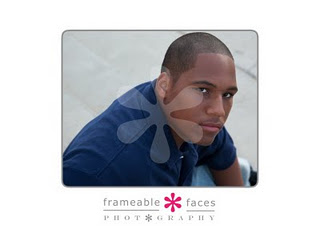
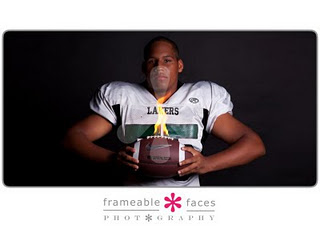
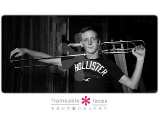
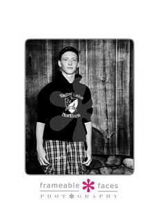
I recently had a close family member say to me “This is such a cute picture! It’s too bad his head is cut off here at the top. I bet his mother would’ve ordered it if you hadn’t cut his head off.” When I gave my answer, “I meant to do that”, she questioned why?
Sometimes, the focus isn’t supposed to be on the cute outfit a child is wearing. Or the fact that that sweet little girl is off center…It just makes the image much more interesting. When I photograph a session, I want the final images to “call” to the parents, grandparents and the person who’s seeing them. So sometimes, I’ll crop a little closer in on the head. And I even do it on purpose!!
As I went on to explain further, I remembered an article that was written by another photographer in Baltimore. So, here it is. It perfectly describes me, and most professional photographers.
I Meant To Do That
Make no mistake, my work is unique! I have a style of my own and it is somewhat uncoventional. My clients are usually looking for something fresh, stylish and more contemporary than what many “traditional” photographers offer.
That being said, there are some things you may notice when looking at my work that is different from what you might be accustomed to…
“Tight Crops” – This means super close close-ups where often the face fills most of the frame of the image. These images are about the eyes, and often the top of the head is not included in the image. I meant to do that!
“Not-So-Smiley”- So many of us have been brought up to believe that a smile is a requirement to make a great photo. So not true! I love a pensive look as much as a big grin. I meant to do that!
“Let’s Be Negative” – Negative space is when the subject is placed off to the side of an image and the rest of the image is empty—this is done for artistic impact. I meant to do that!
“Left of Center”- The most boring position for a subject in a photograph is smack dab in the middle! I know, I know, not what you always thought, right? Trust me! There is a little something in design called the Rule of Thirds that we photographers often employ to enhance visual interest. The rule states that an image can be divided into nine equal parts by two equally spaced horizontal lines and two equally spaced vertical lines (like a tic-tac-toe board). The four points formed by the intersections of these lines can be used to align features in the photograph. Aligning a photograph with these points creates more tension, energy and interest in the photo than simply centering the feature would. Huh? Trust me, your child does not need to be right in the center of an image for it to be a good portrait! I meant to do that!
“The Light in the Eyes” The hallmark of good portrait photography is good lighting, and the hallmark of good lighting is something called a “catchlight,” – a reflection of light in the eyes. I love big catchlights! I purposely position my lights for the best and largest catchlights, especially for close-ups. Flip through any parenting or glamour magazine and look at the eyes—what do you see? Big bright catchlights! A lack of catchlights leaves the eyes looking flat, dull and lifeless. I meant to do that!
There you have it. I couldn’t have written this better myself. This little article perfectly describes everything I think, and do, when it comes to my photo sessions.
So, my dear, sweet, loving family member who said that the image would’ve been better had I not “chopped” that sweet little boys head off…His mama loved it! (Yay!!!)
And, guess what else??? I meant to do that!!! 🙂
Until next time,
Ally


